Discover how Rimi Baltic and Scandic Fusion partnered to build tailored SAP BusinessObjects dashboards, providing actionable insights from checkout efficiency to loyalty analysis and driving data-informed decisions across departments.
Rimi Baltic is one of the largest retailers in the Baltic States and part of the ICA group. It is known for its four chains that are favorite among customers – Rimi Hyper, Rimi Super, Rimi Mini and Rimi Express. From 2020 Rimi also has an e-store in all three Baltic countries. Rimi offers a wide range of products, including groceries, household items, and fresh produce. It is on a mission to make the shopping experience not just better but also more efficient and eco-friendlier.
The collaboration between Scandic Fusion and Rimi is both dynamic and productive, driven by the great people within the Rimi team who consistently bring challenging requirements to the table. Over the years, this partnership has yielded numerous interactive dashboards and pixel-perfect reports, along with several comprehensive SAC planning solutions. Additionally, we have been involved in Business Objects (BO) upgrade activities, including testing and troubleshooting dashboards after upgrades. We have organized both super user and end-user trainings to enhance the overall user experience and confidence with the BI tools.
Throughout our work together, we’ve had the opportunity to collaborate with various Rimi departments, including Controlling, Assortment & Buying, Human Resources, Marketing, Real Estate, and Supply Chain. Each department brings a unique perspective and set of needs that we strive to fulfill, driving continuous improvement.
"Rimi's challenging and engaging business requirements over the years have pushed us to elevate our expertise and master the art of dashboarding!
Raivis Blaumanis, Data Analytics Architect at Scandic Fusion
Technological landscape
It’s important to highlight that Rimi relies on SAP Analytics Cloud (SAC) for planning and self-service for ad-hoc scenarios, SAP BusinessObjects (BO) as the main tool for business intelligence, and BW/4HANA and Datasphere as the foundation of its data analytics ecosystem. These tools work together to provide a robust data analysis and reporting framework, ensuring that Rimi can efficiently harness its data for strategic decision-making.
In this case study, we will primarily focus on the capabilities of BO that Rimi has capitalized on. Rimi has already upgraded to the SAP BO's newest version, 4.3 SP4, and is utilizing the BI tool to its fullest potential!
Given that BO is not an in-memory BI tool, and the main data source is BEx queries towards BW/4HANA, performance becomes a crucial aspect. Consequently, the dashboard structure must align not only with the user story but also with performance capabilities and data cell limitations. While we won't delve deeply into this aspect here, it is worth noting that optimizing these queries can be a challenging task.
Performance optimization involves several factors, including data source optimization. Here, we truly appreciate the teamwork with Rimi IT, which ensures the efficiency of the data sources and manages the overall technical architecture.
Let's move on to the examples of what we have delivered together. Instead of showcasing a specific BO dashboard (as we have many great ones to choose from), we will concentrate on the visualizations, highlighting their technical aspects and business impact.
From dashboard design guidelines to dashboard use cases
When we think about dashboards, one of the key initiatives implemented together with Rimi is the new reporting design guidelines, which encompass both SAP BO and SAC to provide users with consistent experience across different tools. These guidelines serve as a foundation to transform data into art. They include color palettes, optimal report structure and layout, report elements and visuals with predefined formatting, an icon library, and main naming principles. To streamline the self-service process and expedite report creation while ensuring adherence to the guidelines, templates are available in both tools, and icons are saved as shared elements in BO, making them easy and fast to reuse.

For insights into the general principles of dashboarding do check out this blog post "What is the recipe for a perfect dashboard".
Setting that aside, let's dive into specific visualizations from various departments and their usage.
Get ready to see:
- How store managers keep an eye on activity levels across different checkout types;
- How the marketing department analyzes customer behavior based on club memberships;
- How the Assortment & Buying department compares stores using dynamic charts and clusters;
- How the Assortment & Buying department enables vendors to see their standing among competitors across various KPIs without revealing other vendor names;
- How the Project Managers track their projects and predict potential overruns.
We'll outline the capabilities of BusinessObjects, showcasing features that go beyond the standard functionality. Get ready to see what makes BusinessObjects not just a tool but a powerhouse of possibilities!
Checkout dashboard: Activity levels
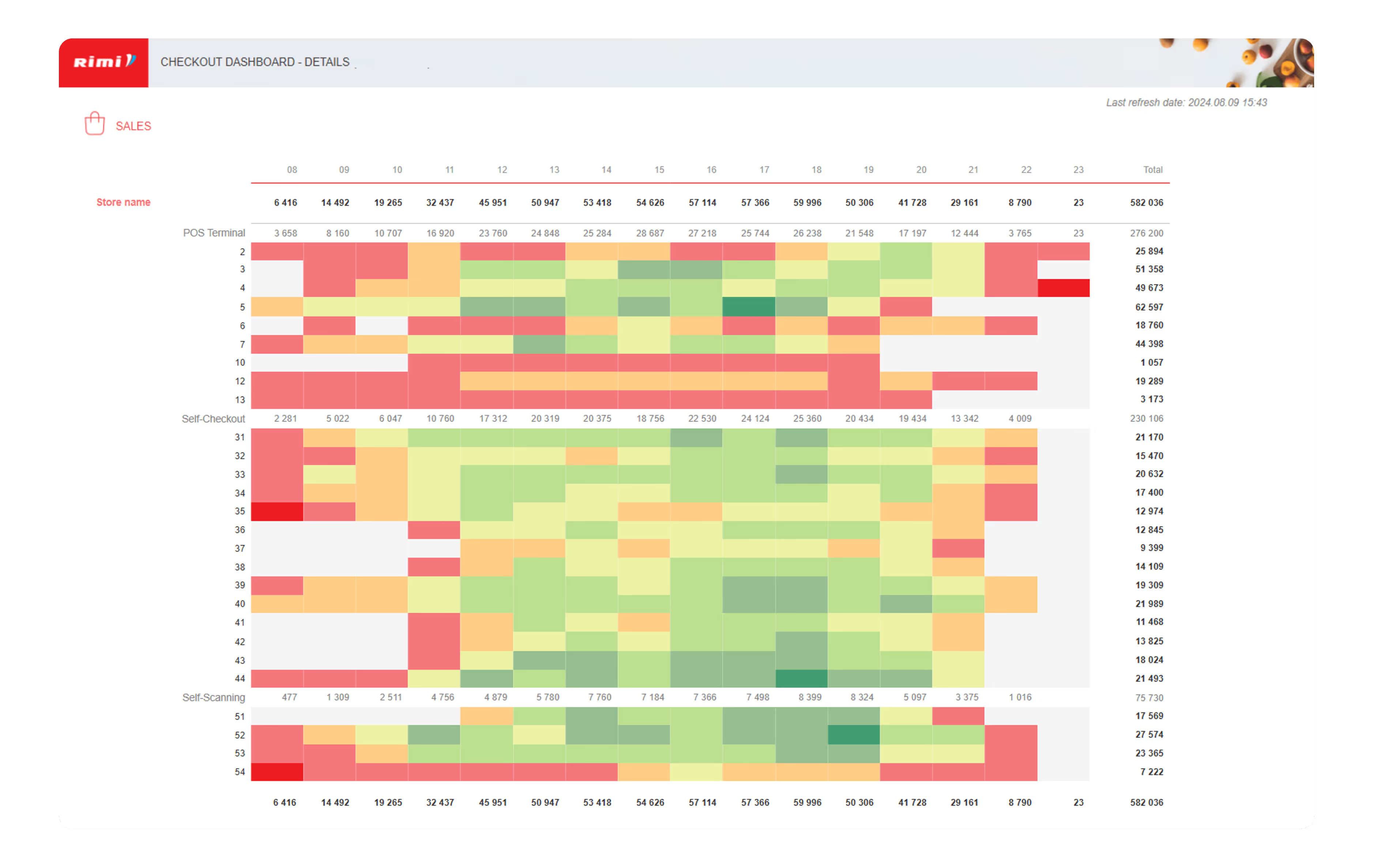
In the Checkout dashboard, the activity levels of the POS terminals within a store are analyzed. This evaluation helps understand the activity levels per working hour and identify peak usage times. Consequently, this information aids in making real-life decisions regarding the need for additional or fewer terminals within the store and adjusting the personnel schedule and store working hours.
From a technical perspective, the dashboard includes a table with conditional formatting applied based on dynamically adapting ranges and selected stores for comparison. This feature instantly highlights which terminal and working hours have the highest number of transactions, drawing immediate attention to key activity periods.
Loyalty dashboard: Customer club combinations
When it comes to the Marketing department, evaluating loyal customers assigned to various customer clubs is one of the focus areas. The dashboard allows for the analysis of the number of customers per club and club combinations. For instance, it can identify groups of customers who are members of both the pet club and the wine club simultaneously.
Combinations are implemented by creating a formula that checks customer assignments to specific clubs and groups them into valid combinations.
From an end-user perspective, simply by clicking on the chart and selecting a club combination, they can access more detailed statistics about customers in similar clubs, providing insights into various additional characteristics.

Store cluster: Dynamic chart
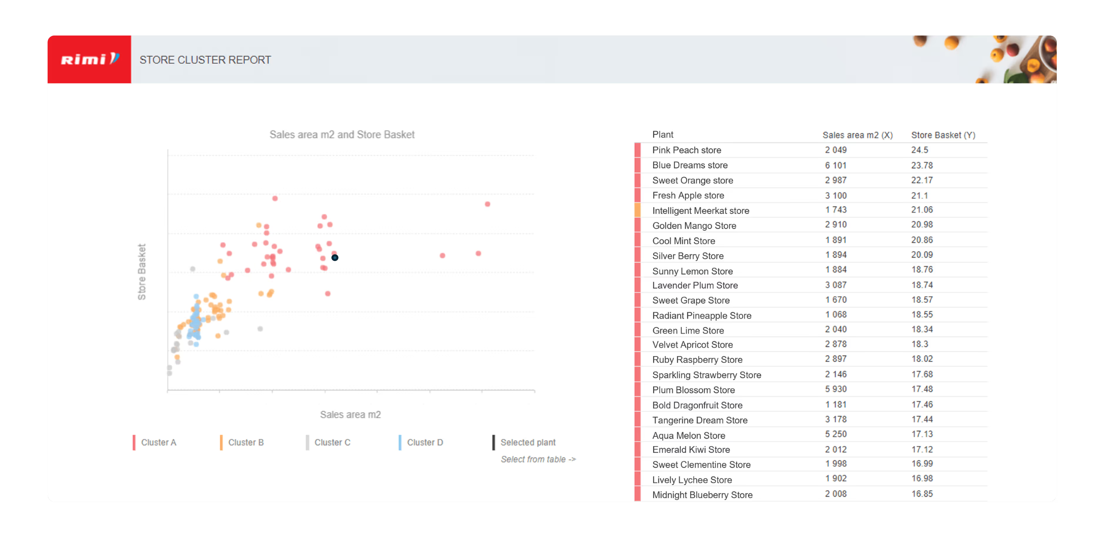
For the Assortment & Buying department, one of the latest initiatives involved grouping stores based on their assortment. Without delving into the complex business logic behind this, let's focus on how the charts were designed to display both the trends for these groups and the specific location of each store within the overall picture. Users can select a particular store and see how it compares to the group trends.
This same chart also provides flexibility regarding the KPIs being analyzed through dynamic KPI selection. Users can choose the KPIs for analysis, such as comparing sales versus billing margin, sales versus square meters per store, or any other relevant KPI. This approach streamlines the analysis process and enhances user convenience.
Vendor dashboard: Vendor concealment
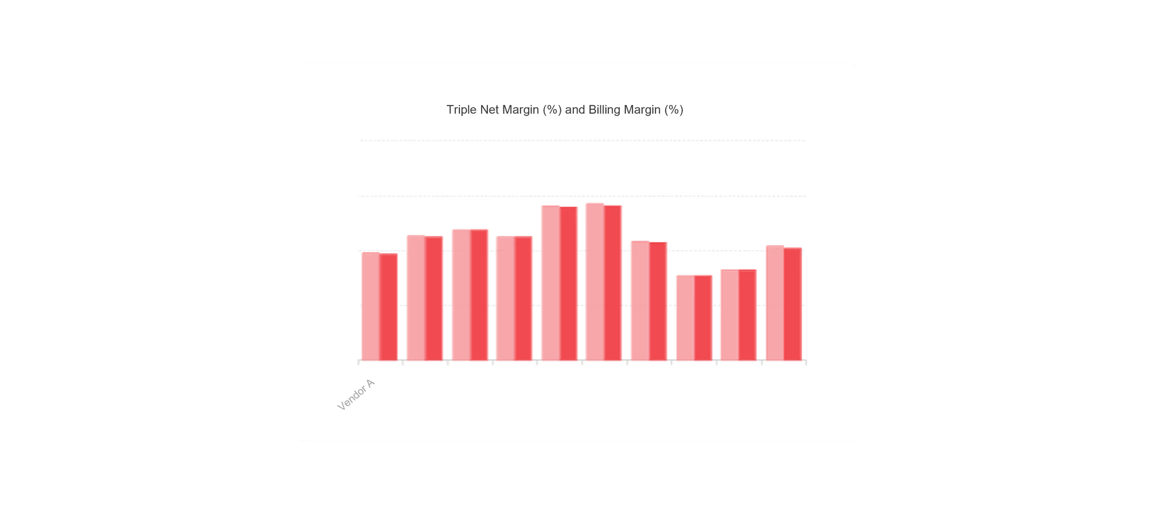
Dashboards intended for a broad audience often have unique requirements. For instance, a vendor might need to understand their ranking compared to other vendors without revealing the identities of those vendors. Meeting this need called for a tailored solution. We designed charts that conceal the names of other vendors, displaying only the numbers.
To achieve this technically, we assigned two attributes to the x-axis: one visible and one hidden. The hidden attribute contains the key values of the vendors, enabling the display of separate top 10 columns. The visible attribute includes a formula that reveals the vendor’s name only when it is selected in the prompts (report parameter).
PMO dashboard: Versatile chart
In the Project Management Office (PMO) dashboard we delve into project analysis, providing a robust tool for examining budgets, forecasts, and actual costs.
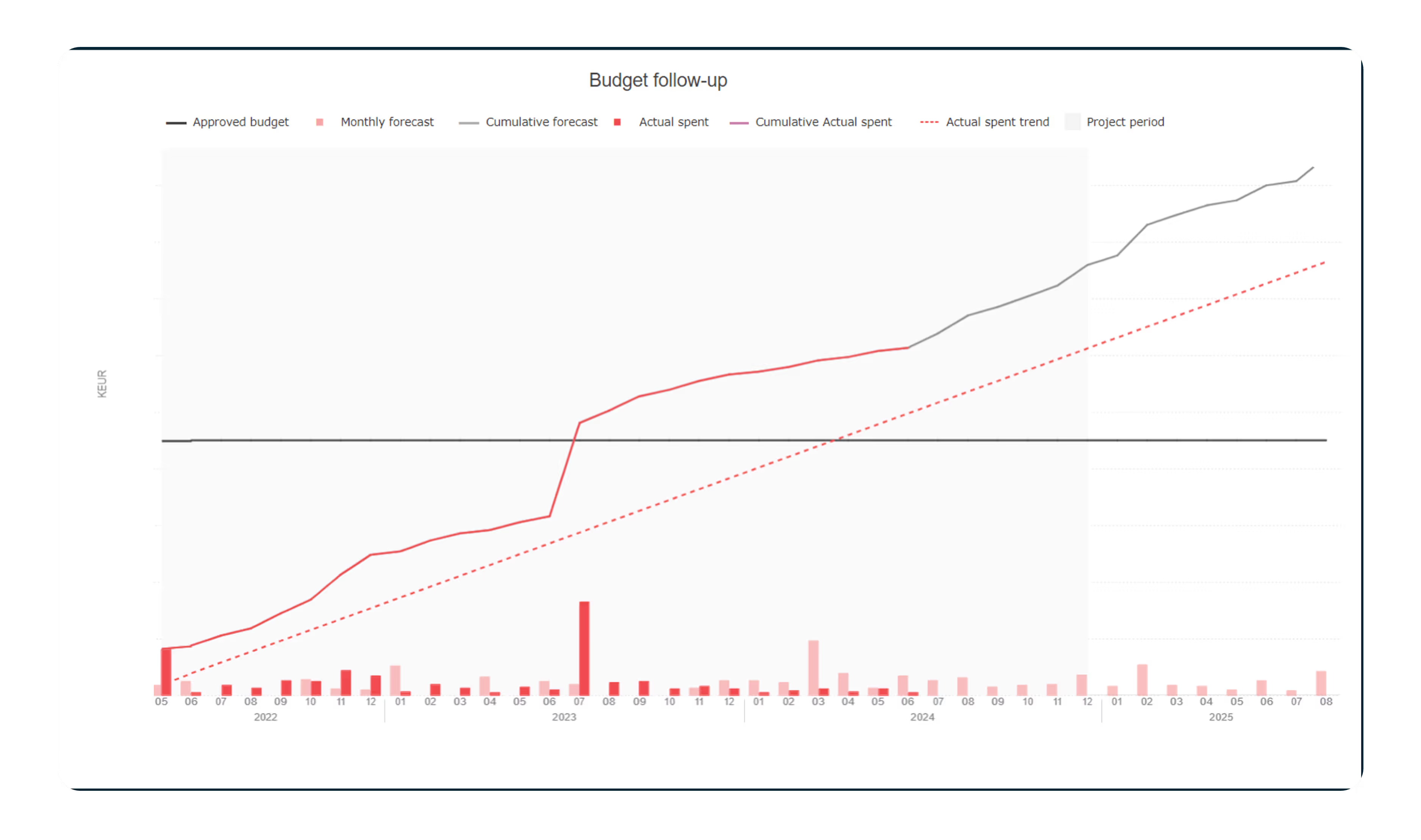
One particularly versatile visualization is combined chart (column + line + area). At first glance, this chart may seem simple, but there is a lot of sophistication behind it:
- The grey background indicates the project life cycle based on project start and end dates.
- The actual spent trend line is calculated based on average monthly expenditures, projecting the amount over the project duration.
- The forecast line is a cumulative line that includes monthly forecasts only if the forecast month is after the selected reporting month.
Thanks to this chart, project managers can better monitor budget adherence and predict potential overruns.
Onward and Upward
The collaboration between Scandic Fusion and Rimi continues to thrive. We are already making strides in new Business Objects (BO) initiatives, such as developing dashboarding solutions for store benchmarking and creating a solution to represent personal costs for the HR department. Moreover, the number of planning solutions in SAP Analytics Cloud (SAC) is growing, and we are currently co-developing an IT cost planning solution.
Our partnership has been a powerhouse of "out-of-the-box" solutions, and we look forward to future projects that drive more growth and improvement. With a solid foundation of mutual respect and technical excellence, we're excited to continue delivering great value to Rimi in supporting their mission.

.png)
.avif)


